The Hell - Divine Comedy
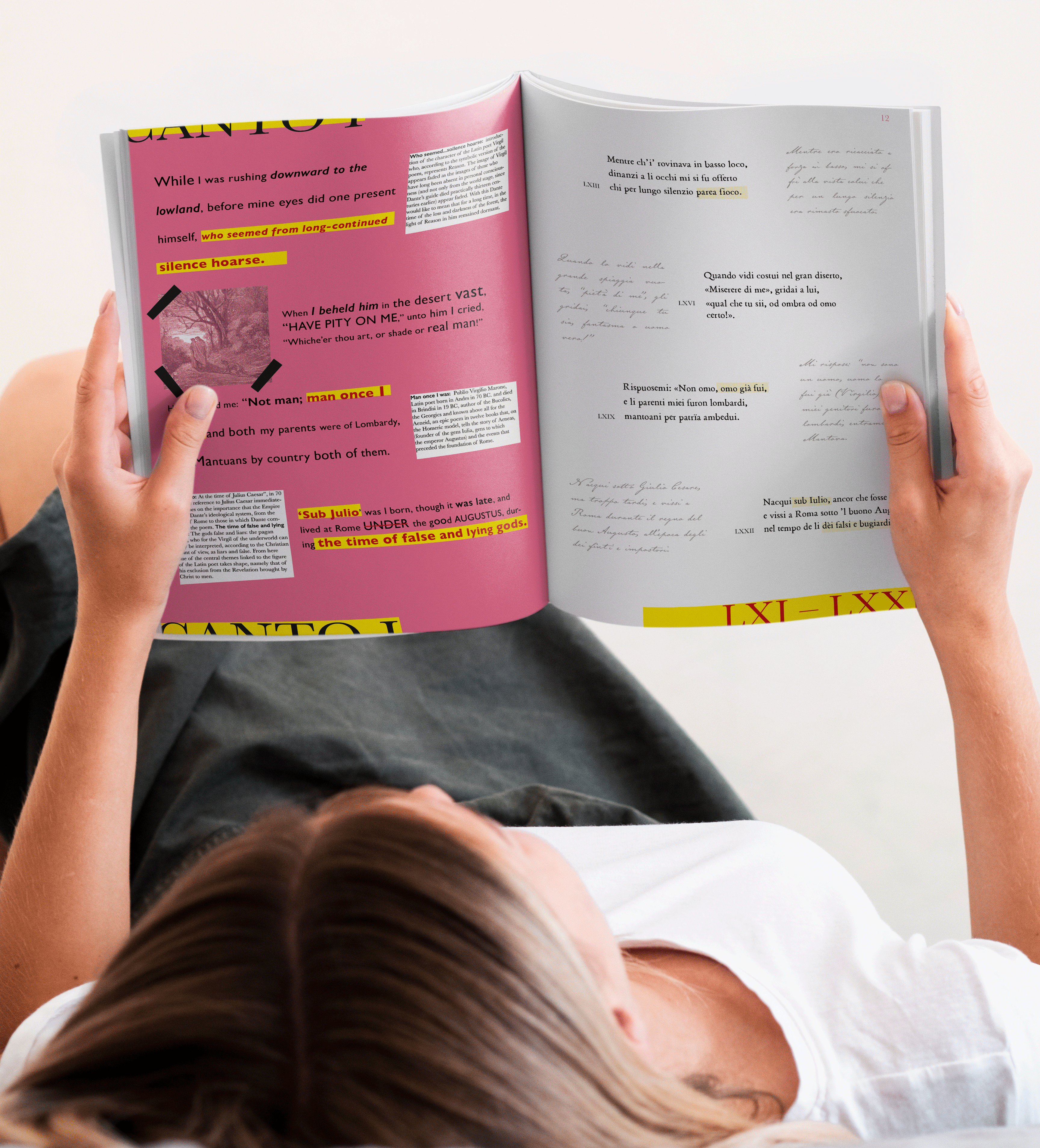
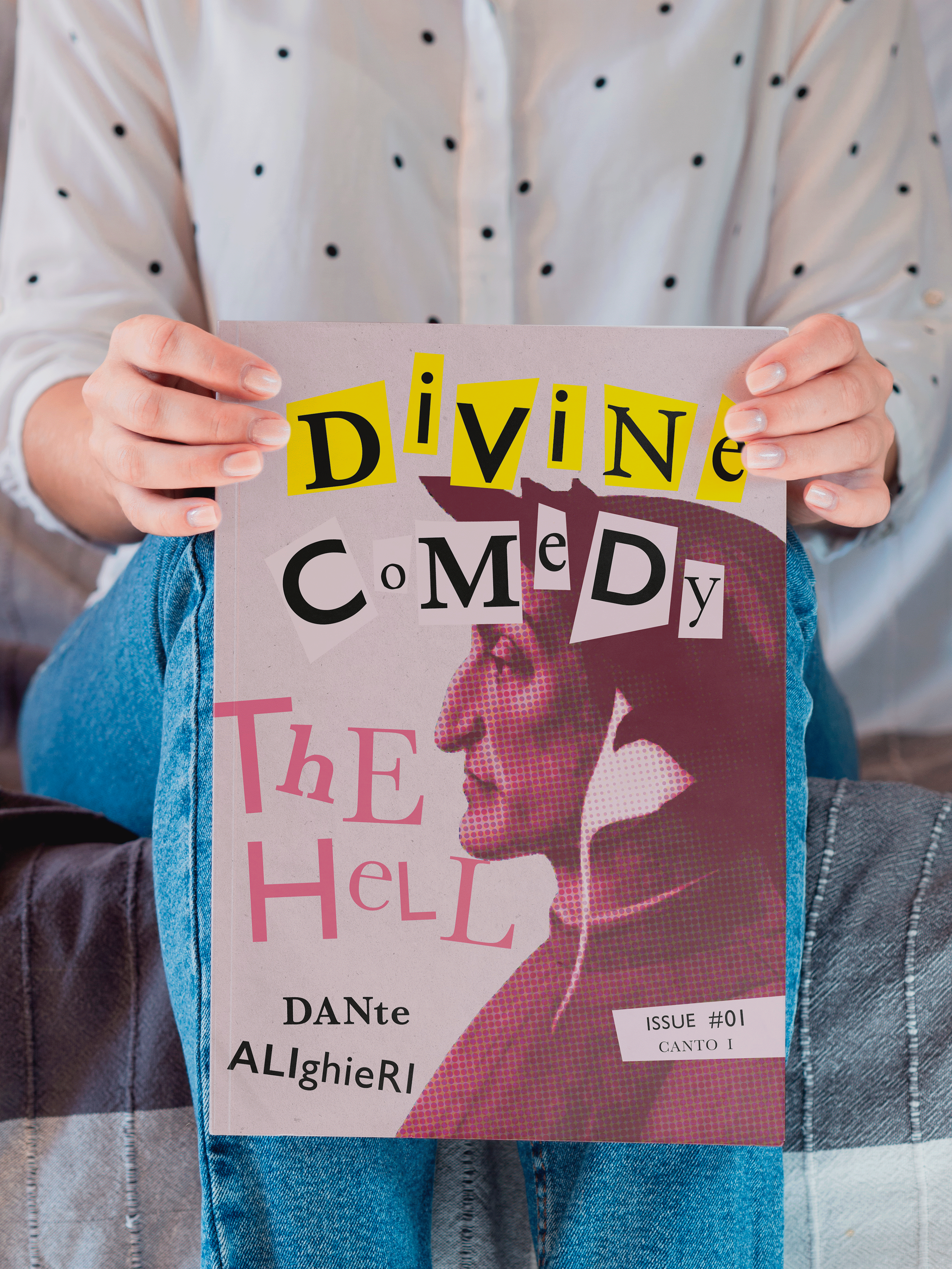
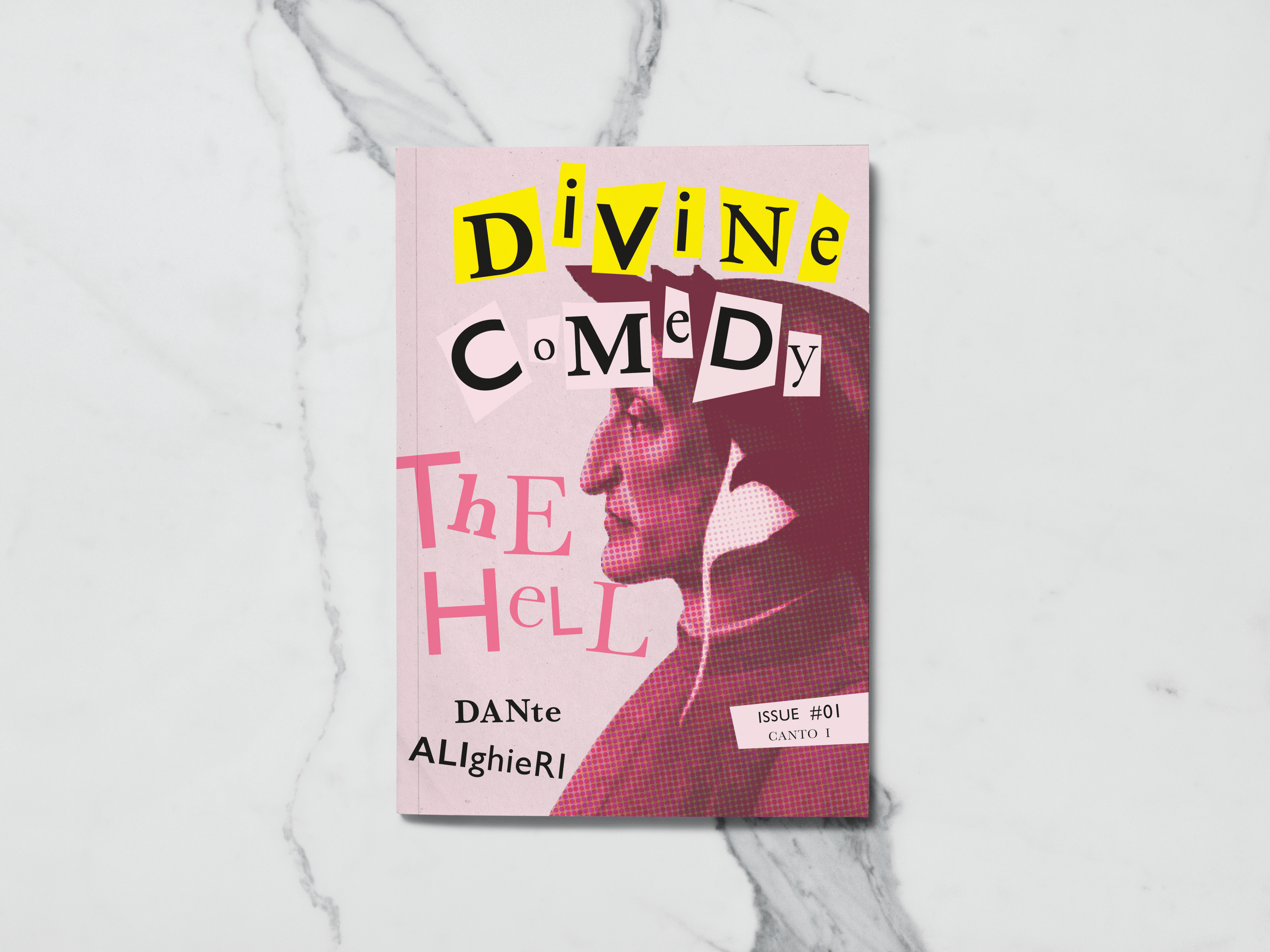
“The Hell”, 1st issue of the magazine “Divine Comedy”.
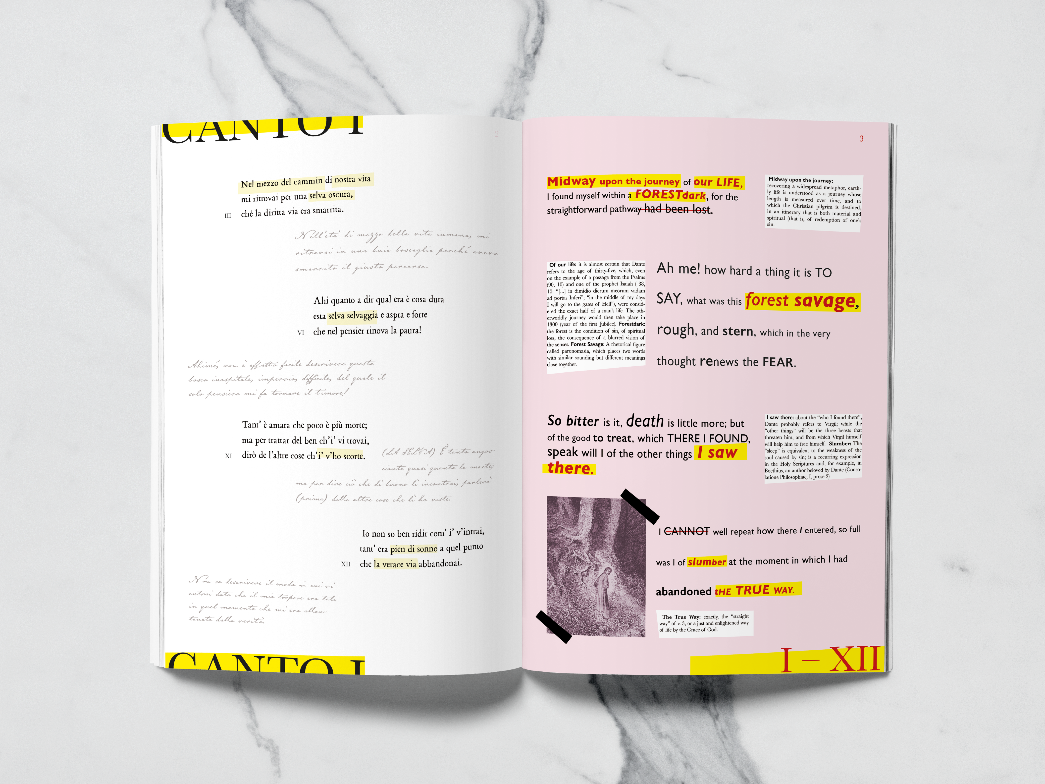
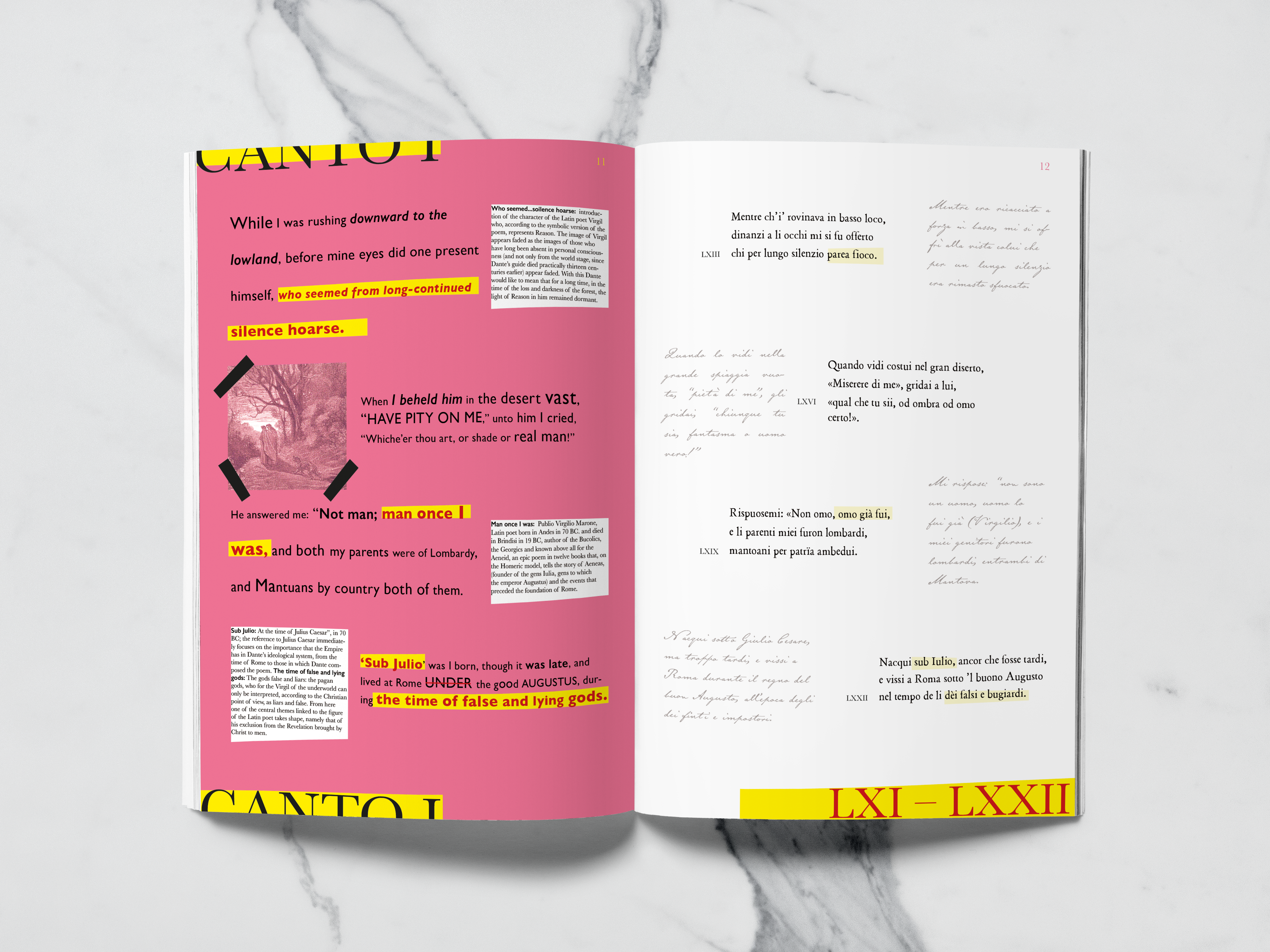
"The Hell" was born from the idea of revisiting this great classic, The Divine Comedy of Dante Alighieri with a modern look, and how clever and inspired design work from the 14th century could be more appealing to the young public of today.
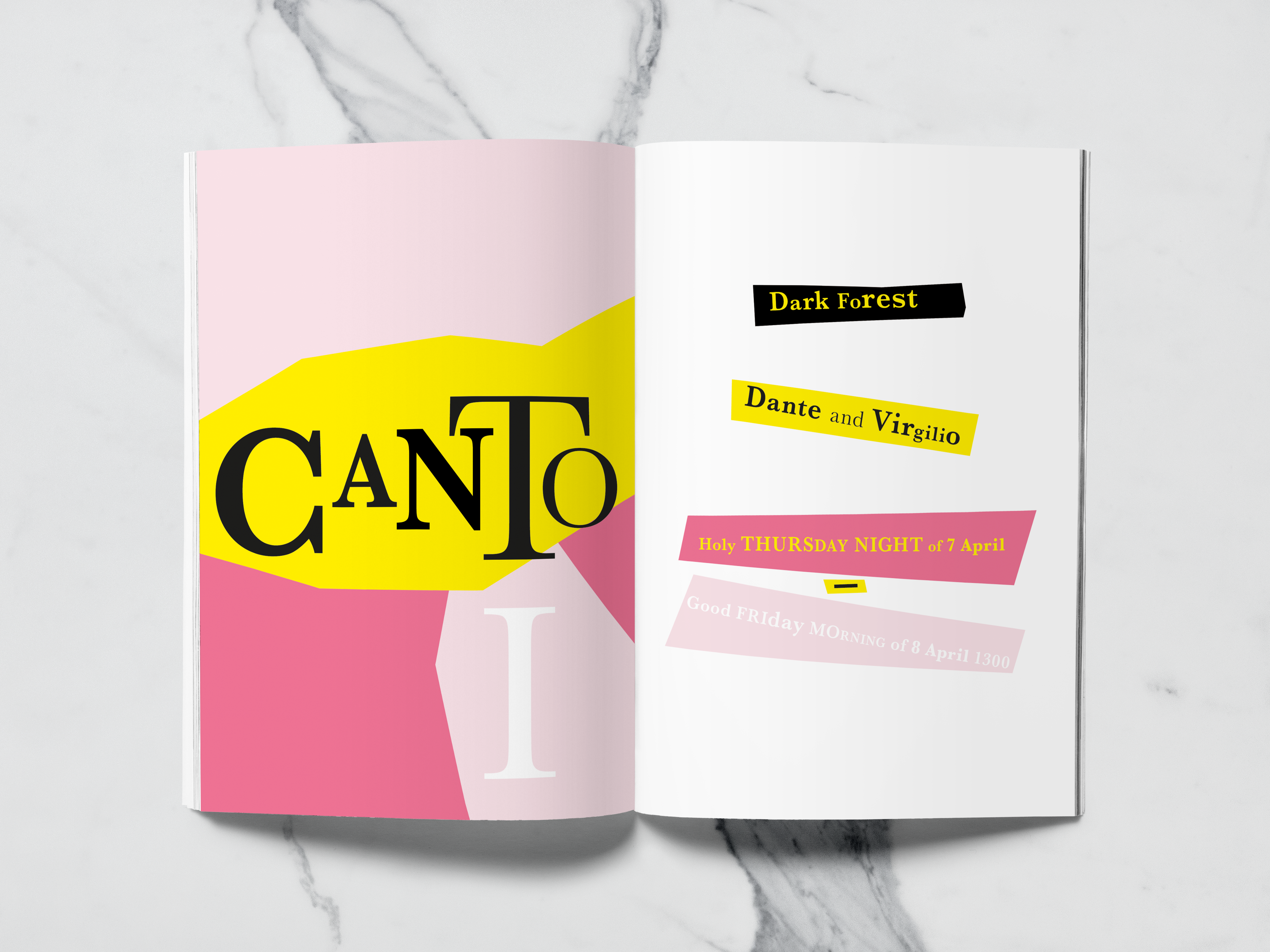
I typographically interpret the first cantica, integrating the version in the original language with Longfellow’s Translation and I add the illustrations by the famous French illustrator Gustave Doré.
Thinking about the user’s experience reading, I also decided to insert notes and the explanation of some keywords, which are very important for a better understanding of Dante’s work which is famously complex.
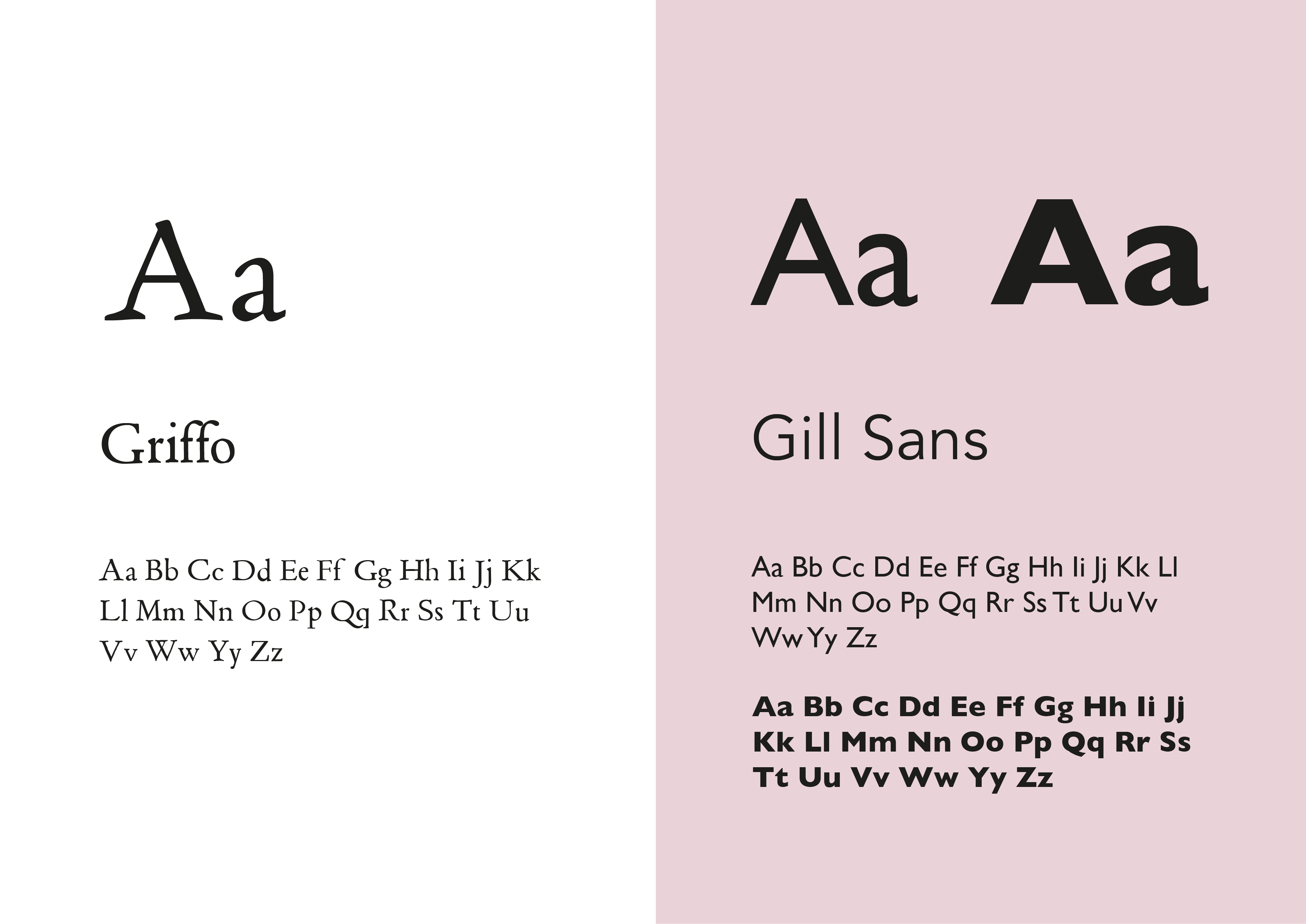
To accentuate the temporal diversity of the two versions, I decided to add, a font of the 15th century, called Griffo, for the original language version, Florentine; and for the English translation I used a typographic character of the 20th century, a modern sans serif, Gill Sans, in regular and bold weights.
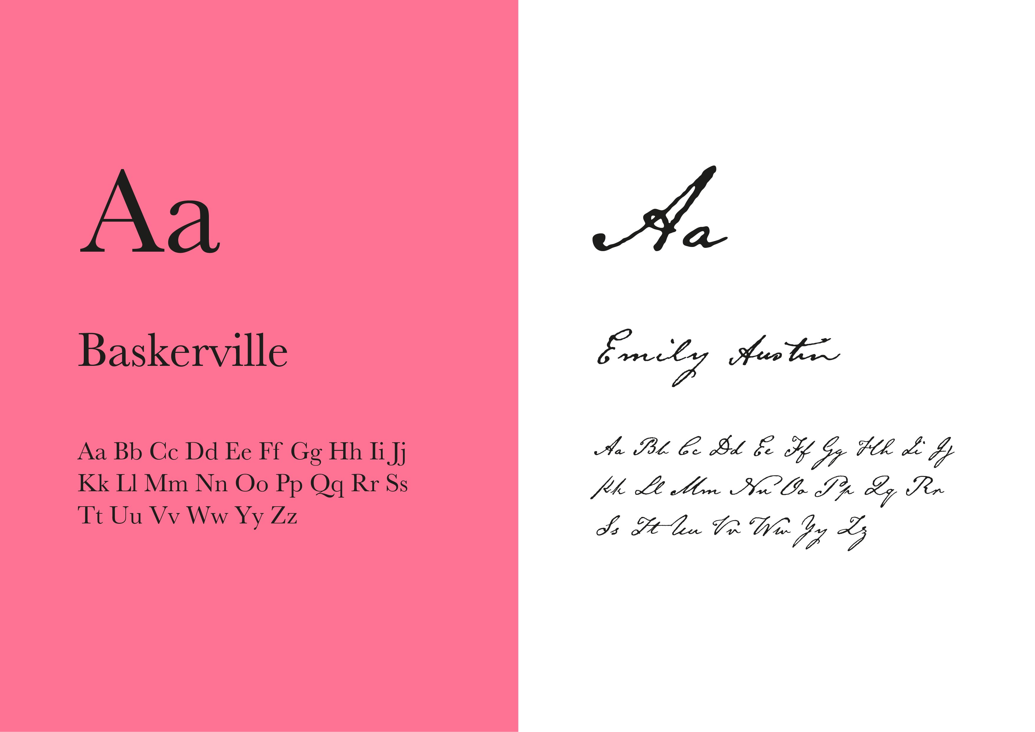
I included Emily Austin font for the notes, to give the idea that they were handwritten, to give a more organic feeling, just like when you write down something quickly.
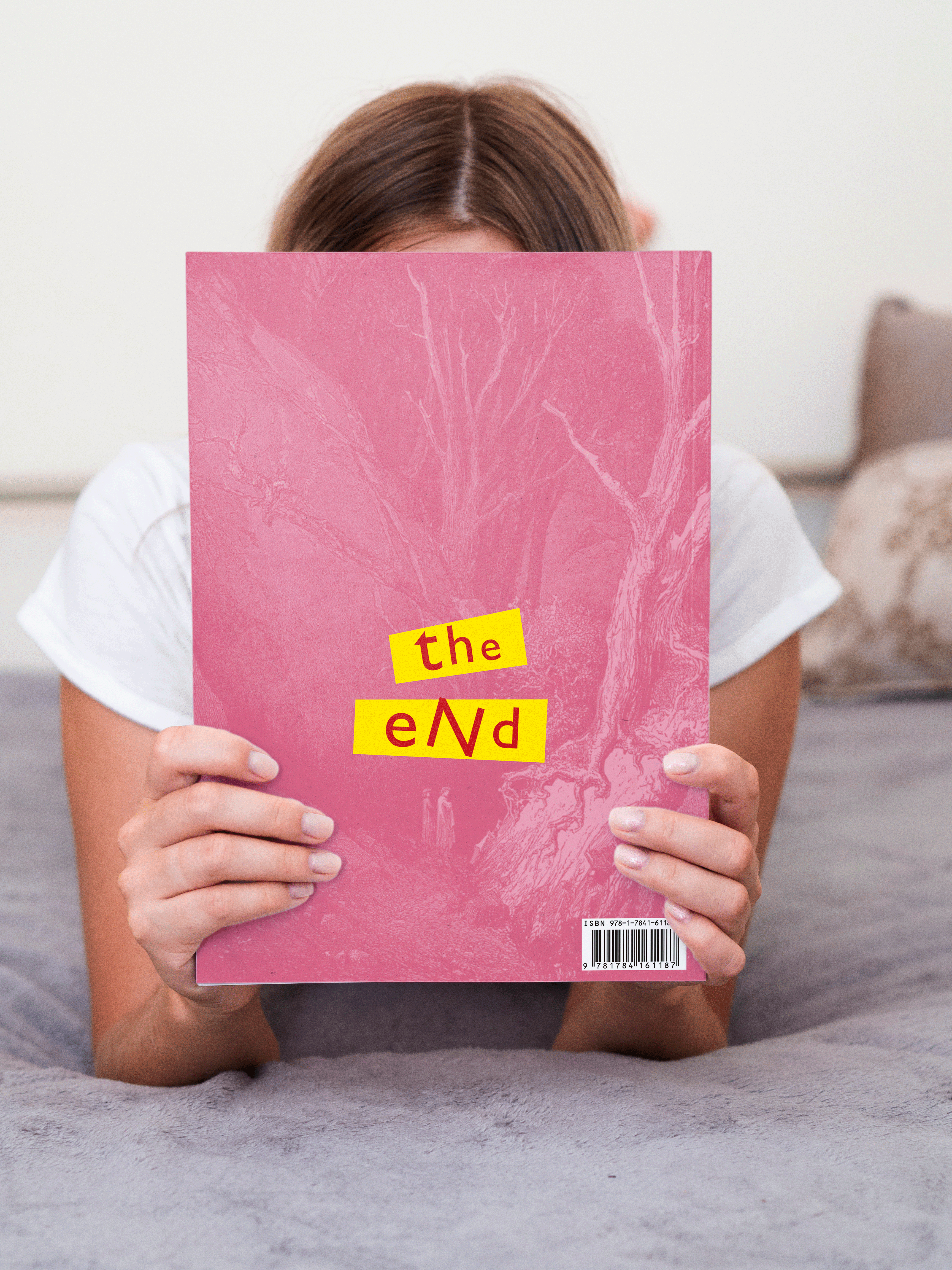
This design aims to bring the contemporary audience closer to a classic piece of Italian litterature.
It is light to carry in the backpack and easy to read anywhere.
